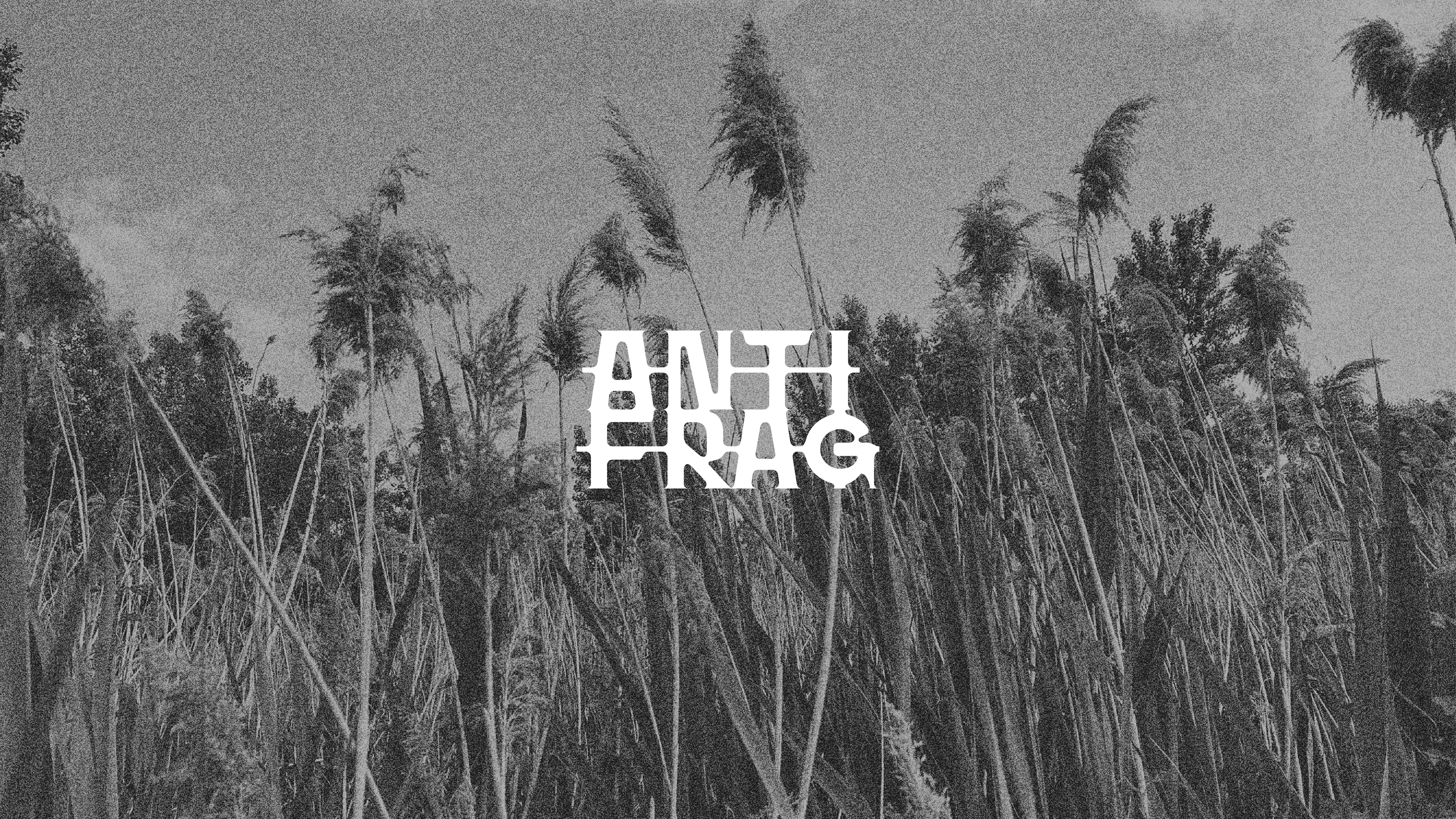
Anti-Frag
Anti-Frag is a festive, self-managed event that blends electronic music, wild camping, and shared moments in the rural setting of Saint-Aubert. Imagined as a free and collective celebration, it comes to life through DIY sounds, bonfires, and winding streams.
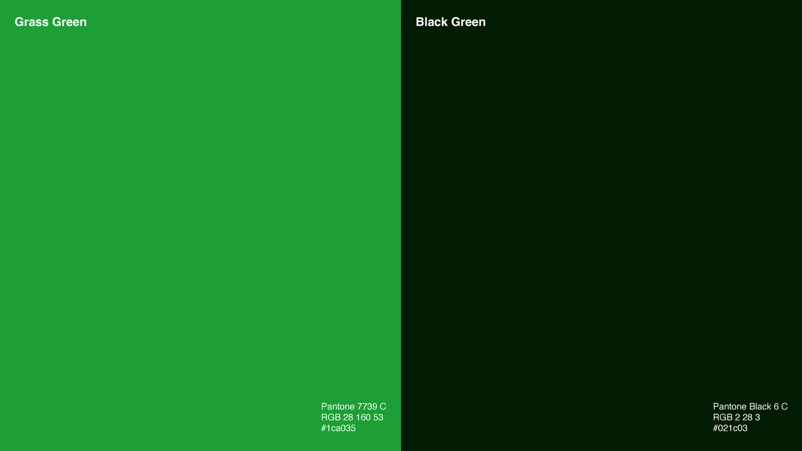
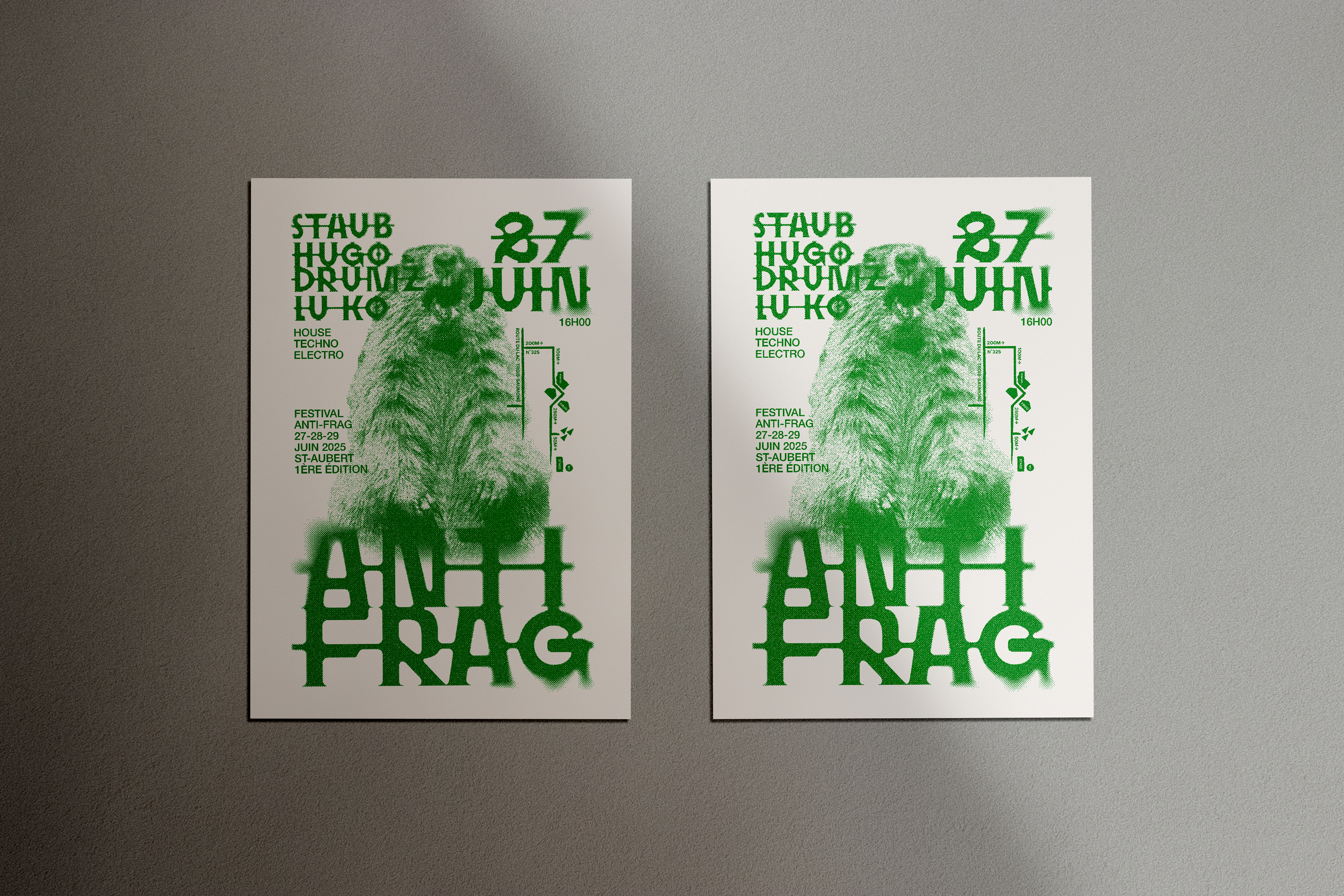
The visual identity created for this first edition draws on protest and countercultural aesthetics — stencil-inspired typography, negative space, and raw forms — to embody a symbolic resistance to the spread of invasive phragmites.


The typography of the Anti-Frag logotype is based on a customized version of the Hyper Scrypt Stencil typeface, reworked to better capture the spirit of the event. By altering certain characters and emphasizing negative space, I aimed to reinforce a stencil-like aesthetic — raw, bold, and militant — in harmony with the project’s defiant tone.
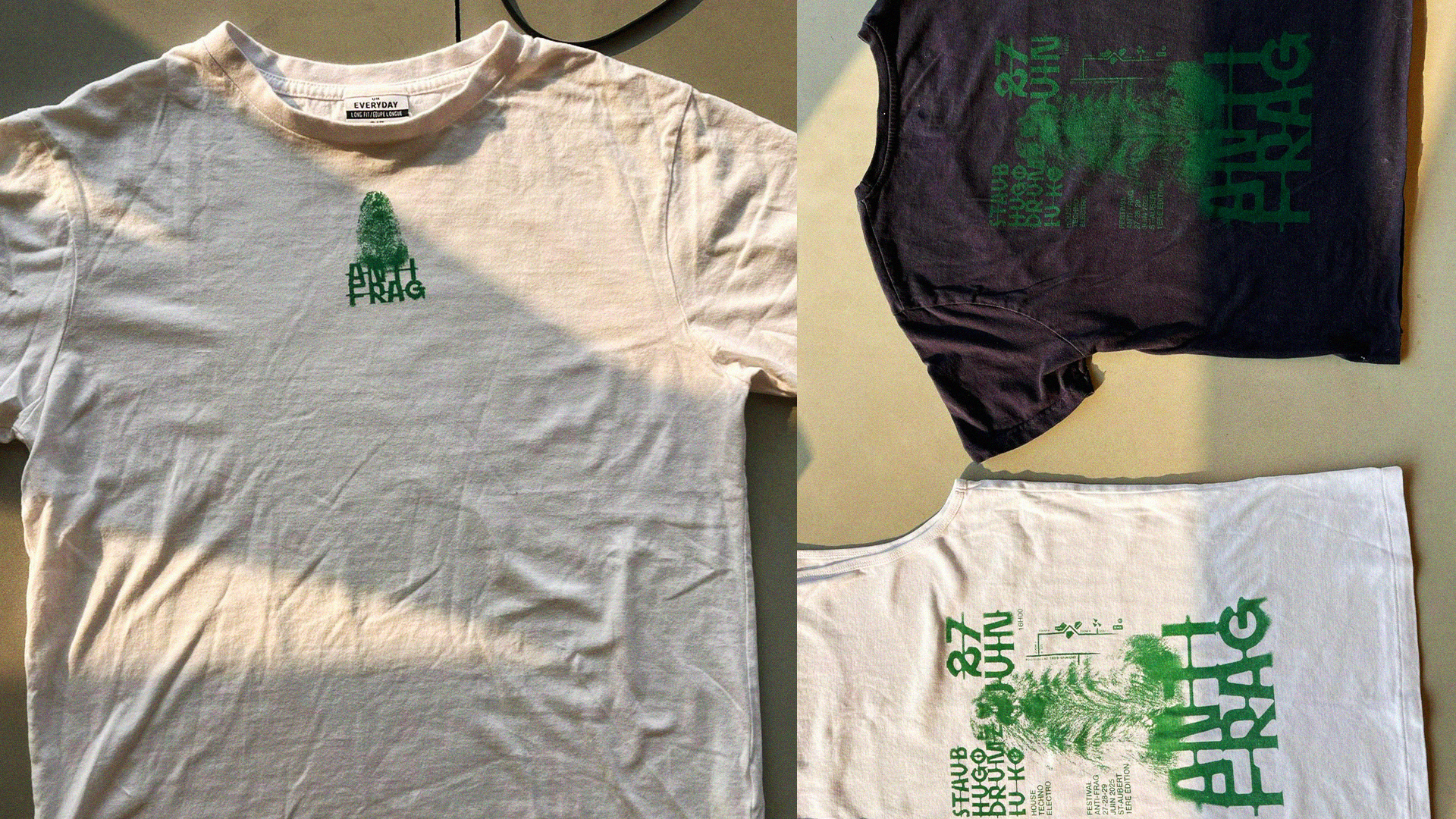
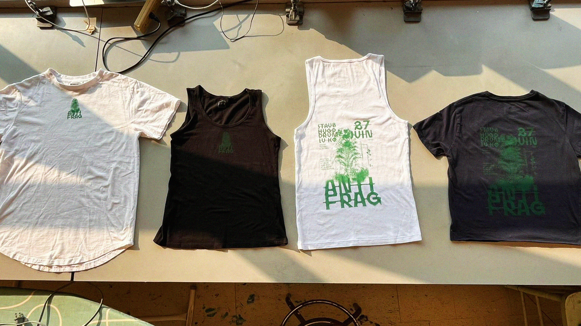
Poster and t-shirt
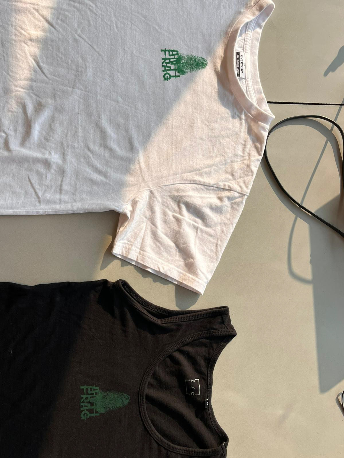
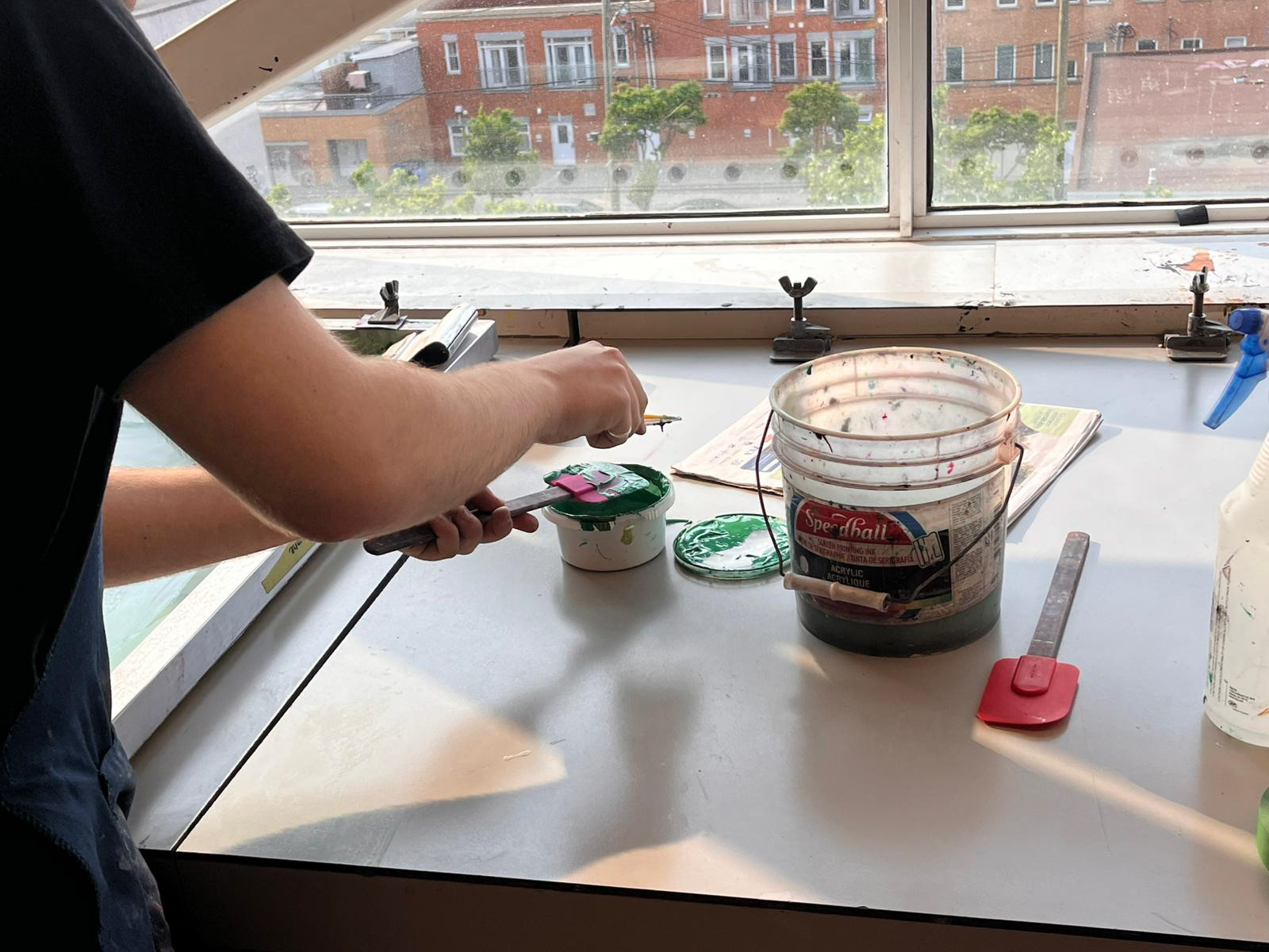
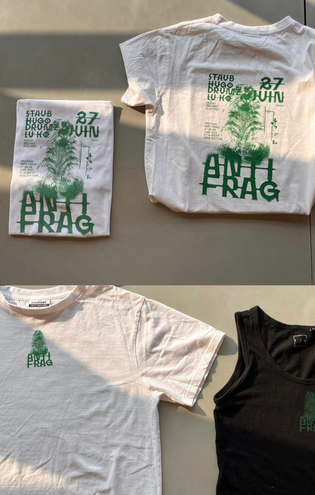
To extend the event’s visual identity, a limited run of T-shirts was printed on second-hand garments, each individually collected and sorted.

Instagram: rgbz.fr
Email: contact@rgbz.fr